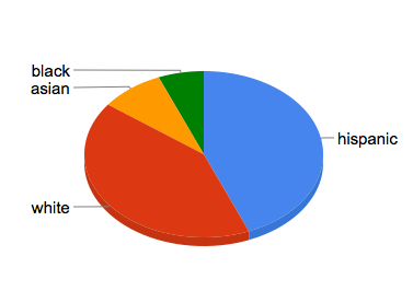
There are many caveats to the following graph, which is about as scientific a description of my person as my astrological sign. (Cancer.)
First, I am a very bad Facebook user: I don’t seek out old friends and I don’t pay much attention to invitations. Second, race here is somewhat arbitrary: more than a few of my friends are multi-racial. Also, race is not ethnicity nor cultural affinity (e.g., sorting friends by their parents’ educational attainment might be more informative.) Finally, for the last three-and-a-half years, I’ve worked for a media company that targets Hispanics, per se, and my workplace is probably the most Hispanic public environment I’ve ever lived in.
That said, here’s one look at the racial composition of my friends on Facebook:

I would love to see how this graph has changed during the course of my lifetime. Perhaps, my children will get to see such a dynamic graph.
Should this be a Facebook or iPhone app? Sure, why not.